
THE VROS
The Vros are Chilean brothers based in the US who make Latin mystic house.
They came to me with a logo they had put together themselves. It tried to say everything at once: a mountain, a sound wave, a compass rose, the four brothers and the four elements. It didn't read at small sizes and it broke in one colour, and a band logo has to live on LED walls, posters and tiny stickers.
So the job was editing. I kept one idea and folded it into the O: a single shape that reads as a mountain, an eye and a compass at once, framed by bold letters that hold up on a stage screen or a t-shirt. I also drew the brothers as characters for the merch they're planning.
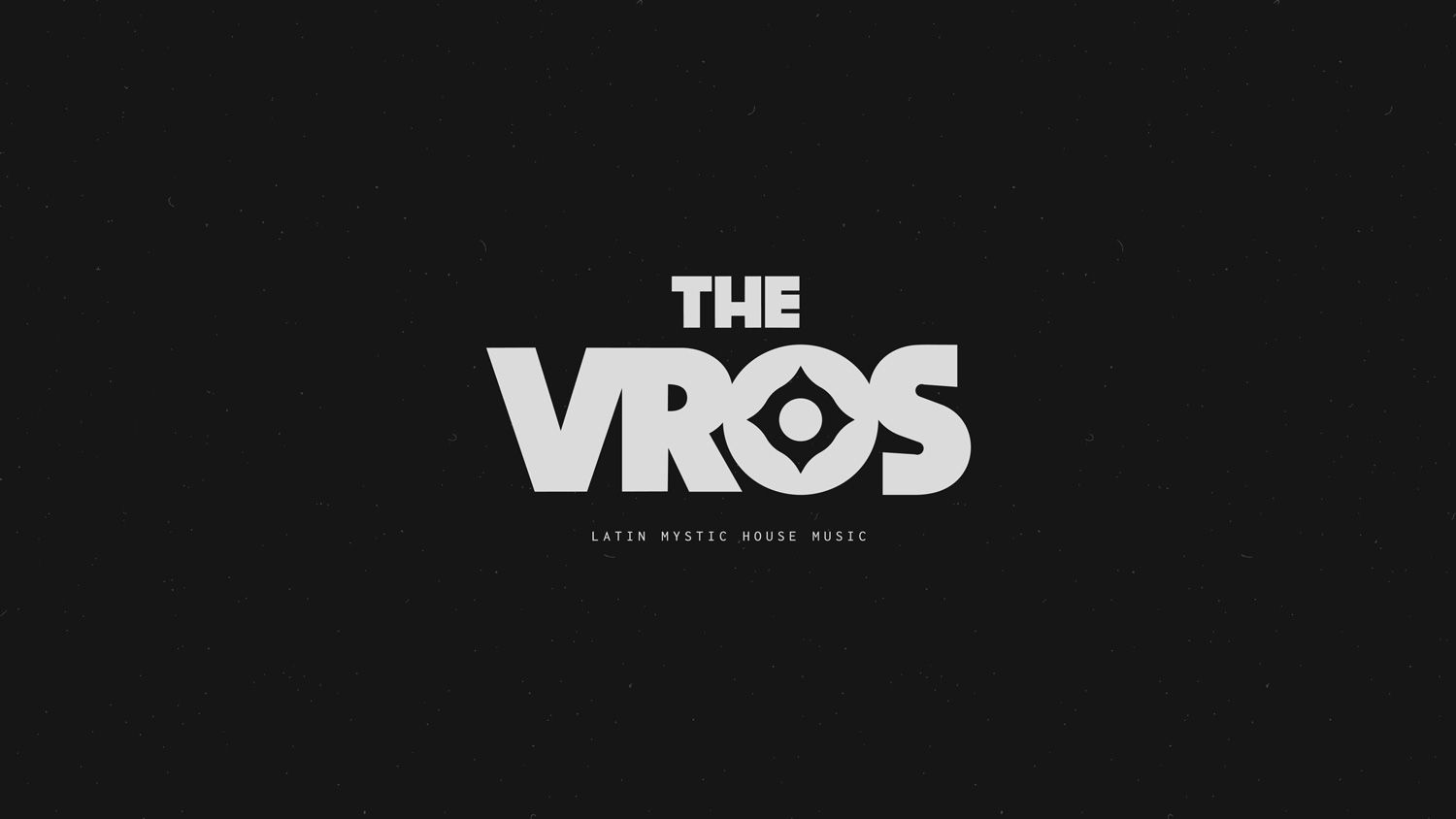
One idea, one mark.
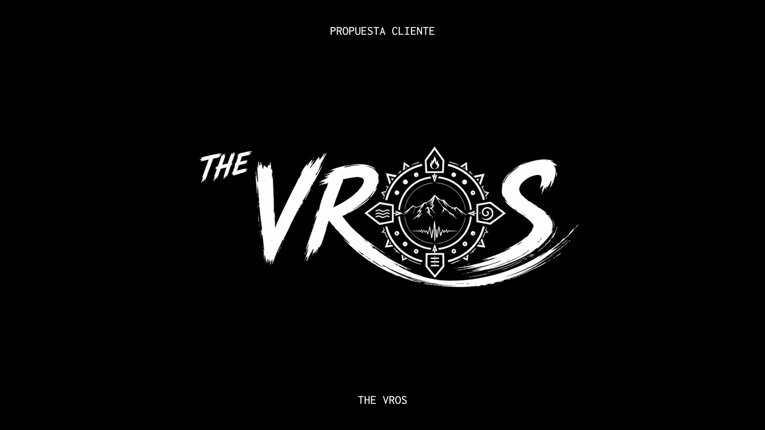
Their starting point: the mountains of Chile, a four-pointed compass for the four brothers (including the one who doesn't play in the band) and a lot of decoration around them. Two strong ideas, buried under the rest.
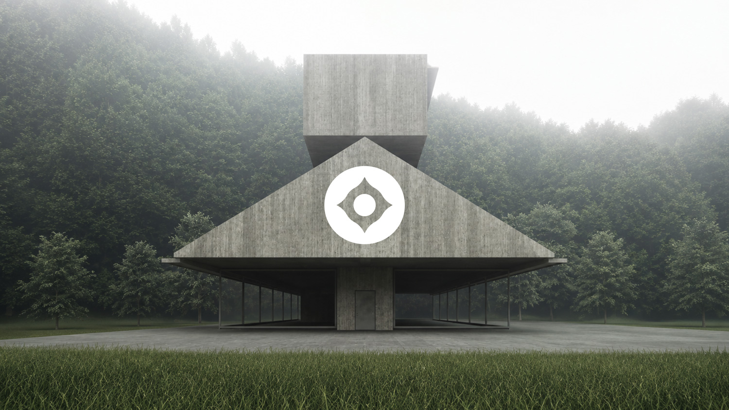
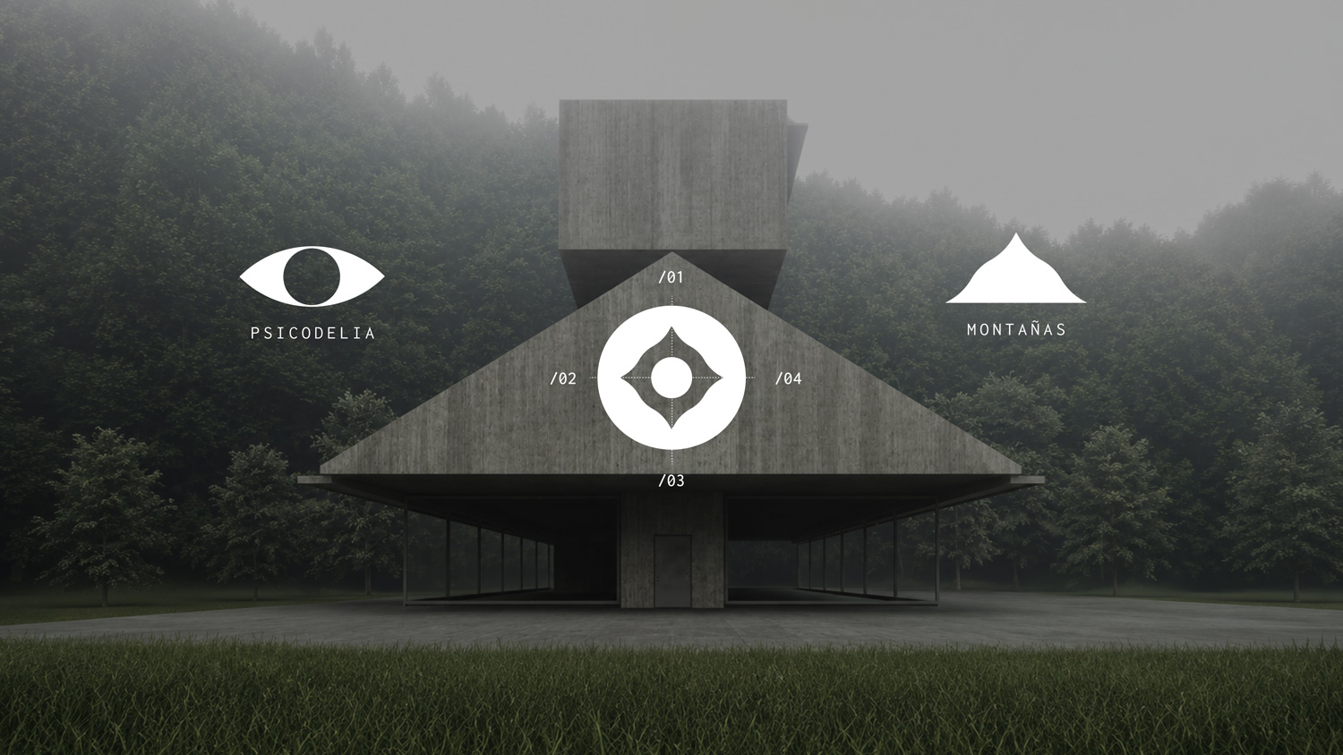
Psychedelia, the compass and the mountains, folded into one O.
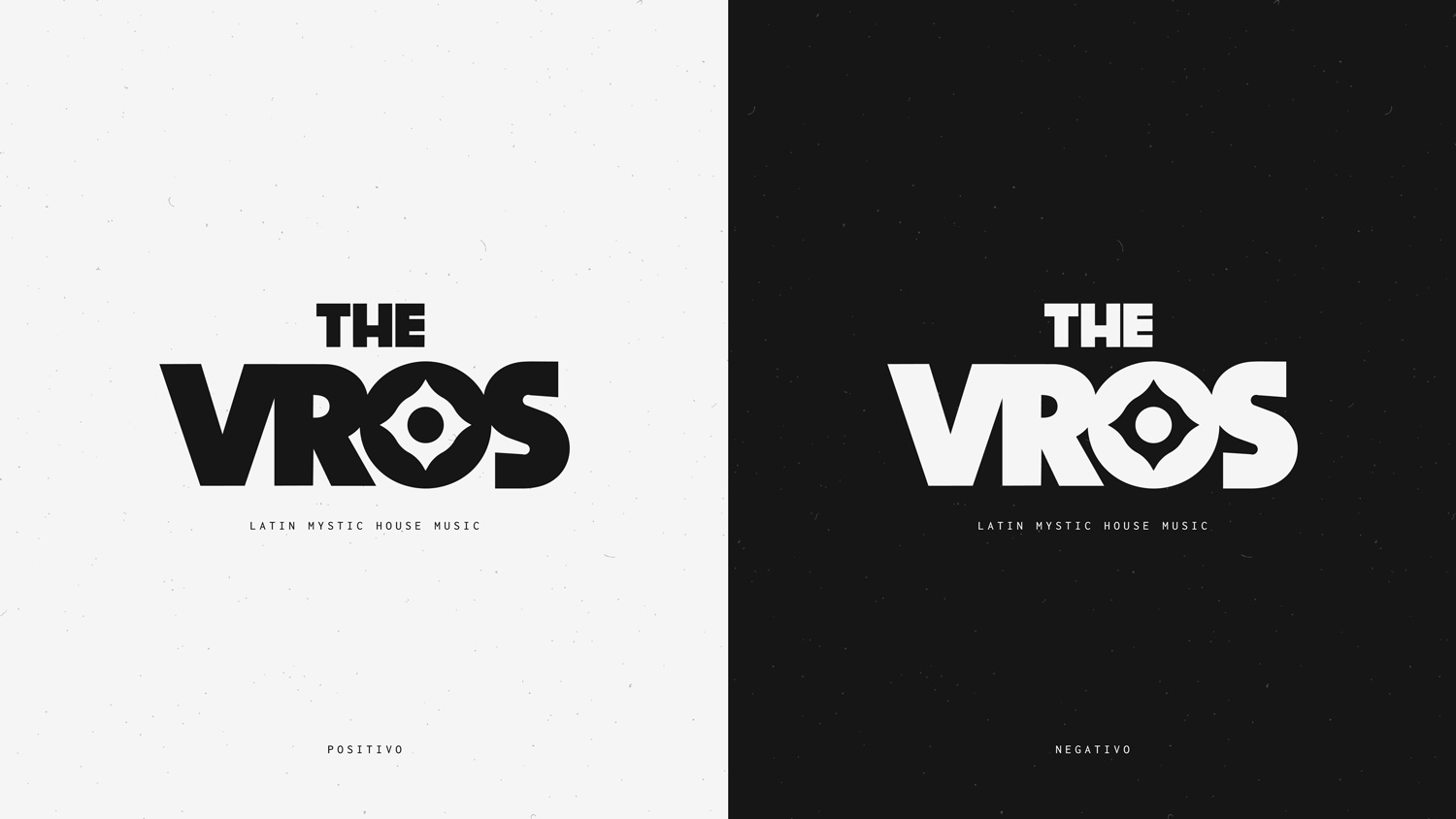
Works in one colour, light or dark.
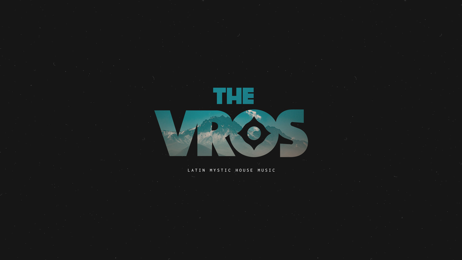
Heavy letters leave room for images: here, the mountains they come from.
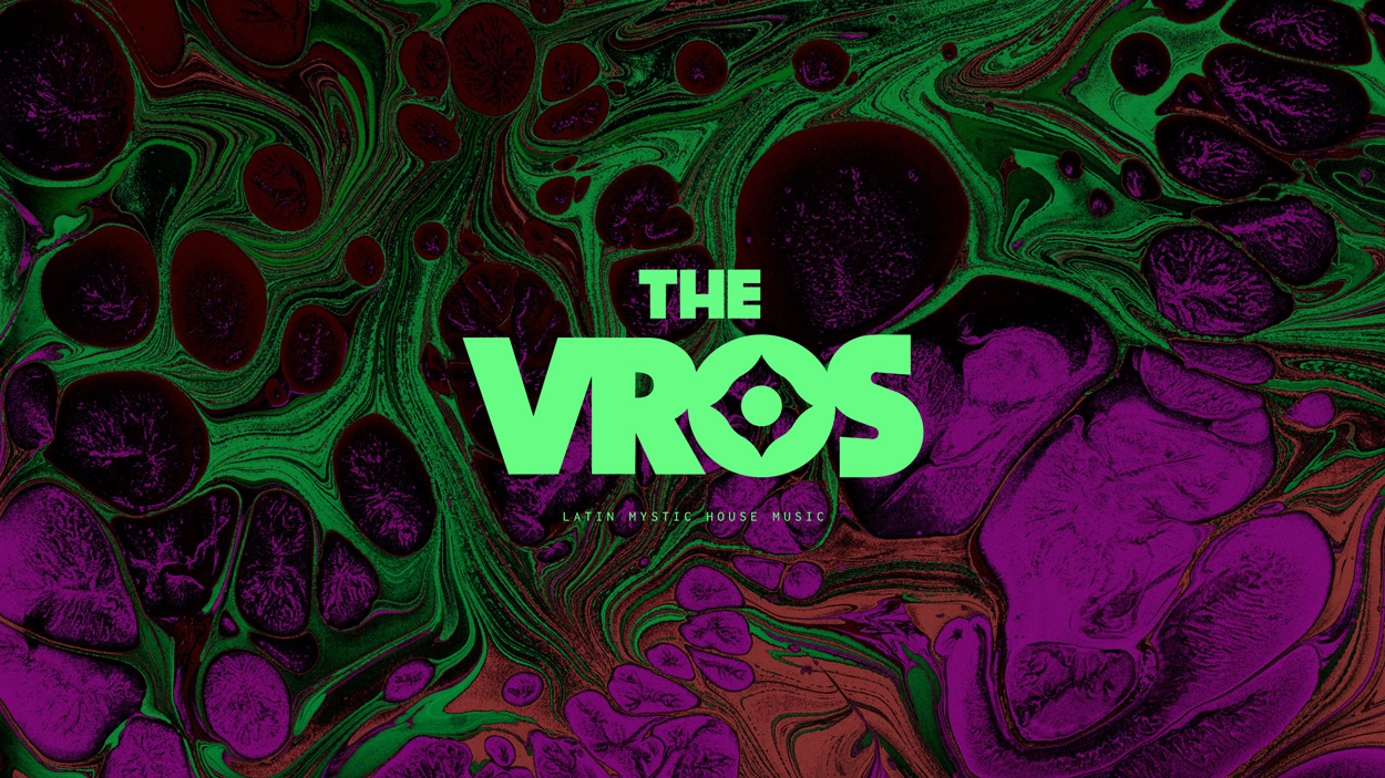
Loud colour when the show needs it.
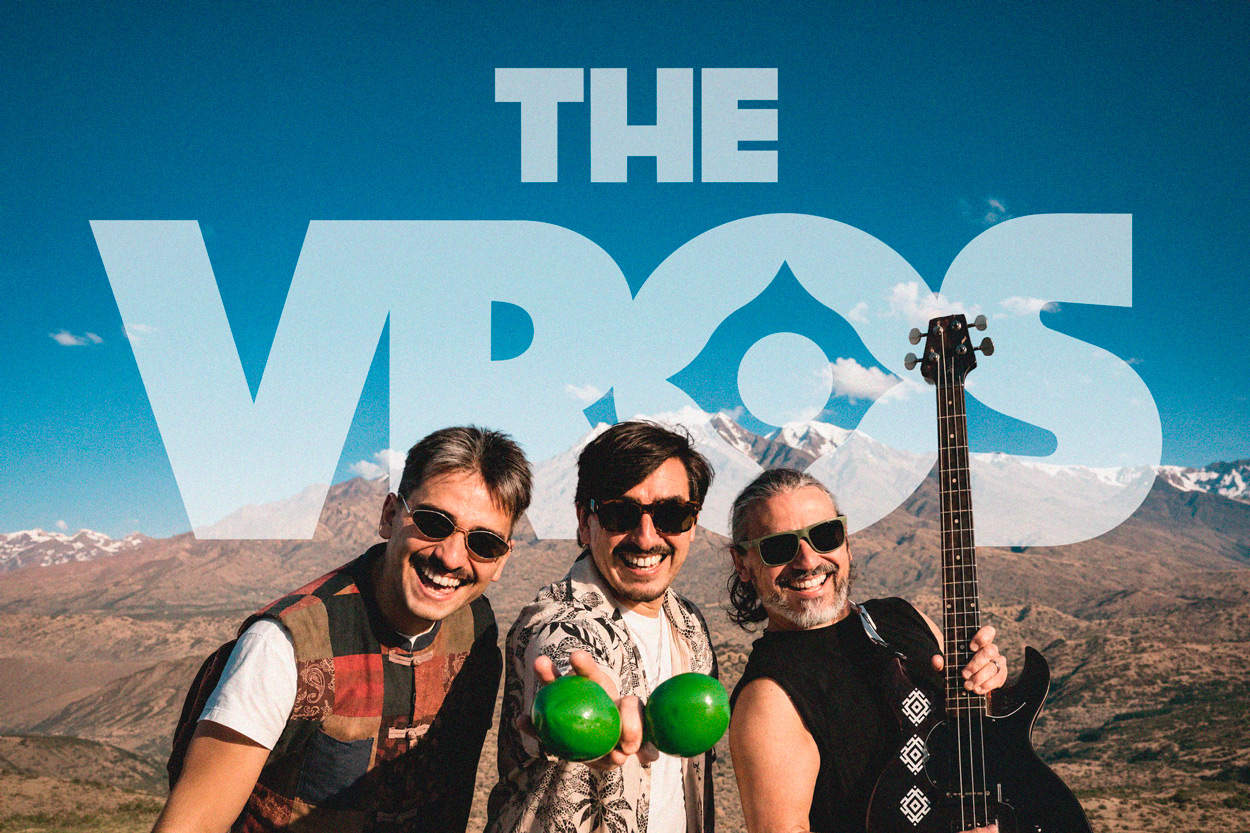
The brothers.
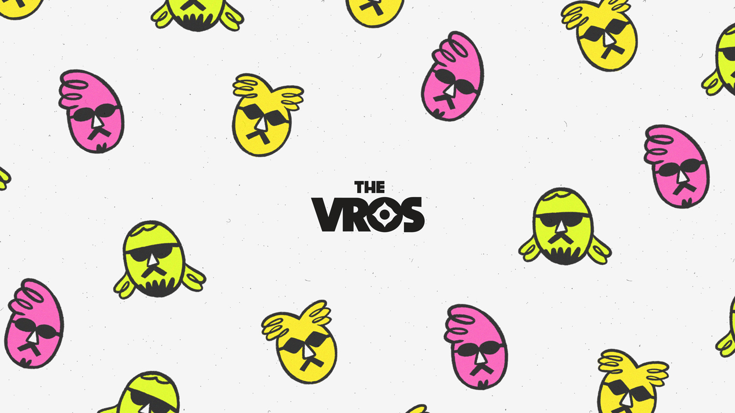
The three brothers who play, drawn as characters.
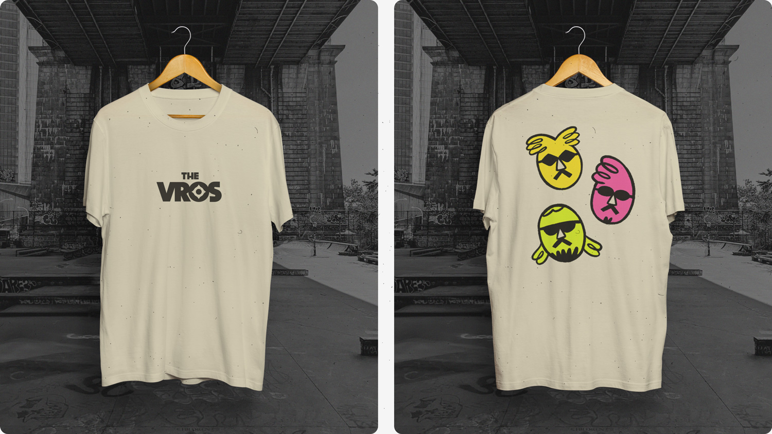
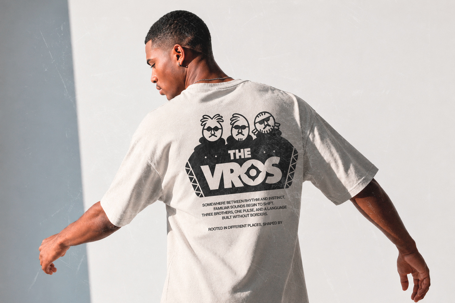
On the back of a tee, for the merch they're planning.
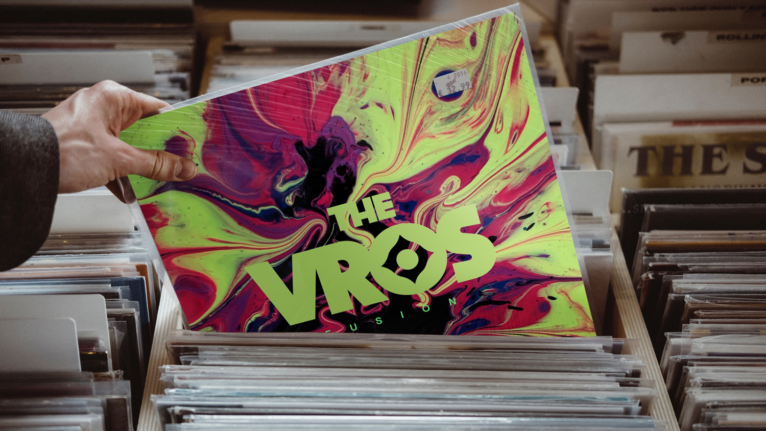
No album yet, but this is where the logo is headed.
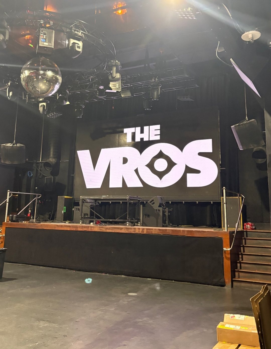
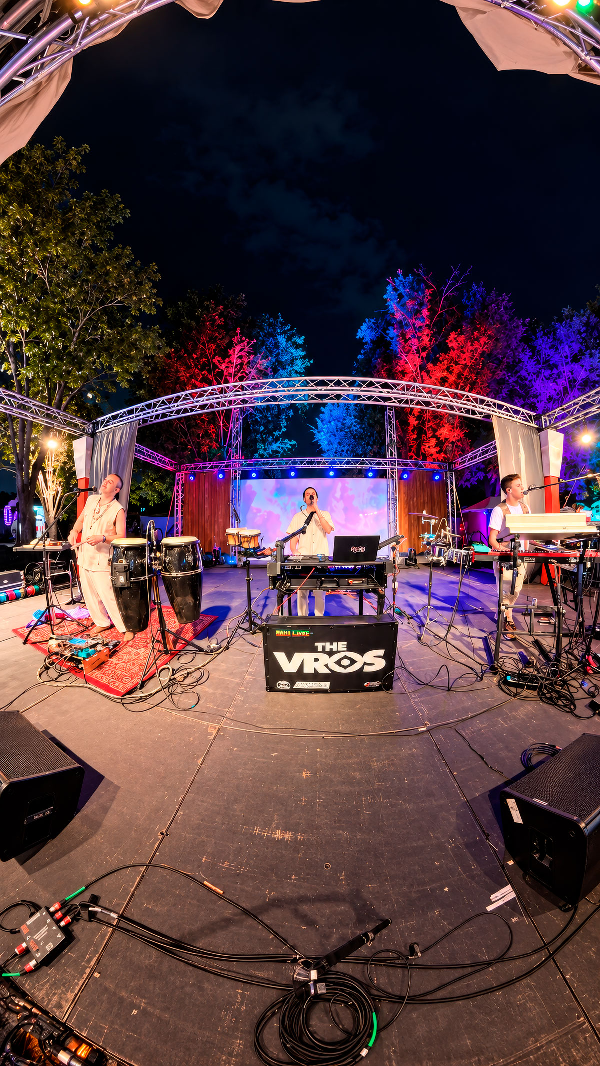
Already on stage, in its first month.