

BAGOOST

Bagoost was a Chilean startup built on a simple idea: help small, independent brands sell to the shops supermarkets ignore: corner stores, kiosks, specialty shops. Think Faire, but for Chile. Shops could discover new suppliers, order from several brands in one cart and pay 45 days later. It closed in 2024.
I joined as Head of Design and built everything visual from scratch: the brand, the website, the app, social media, and internal and external communication. I worked directly with the tech team, three front-end and three back-end developers, and with sales. A few months in, we hired a designer who worked with me on the rest of the system.
Most of the research happened in person. I visited shops and talked to suppliers about how they actually ordered and what got in the way, then turned that into product decisions. Two shaped most of it. Every brand set its own minimum order, so the cart groups products by brand and flags the ones still short before checkout, not after. And since many shops couldn't pay upfront, their available credit sits in the header on every page. For brands, a dashboard showed where their products were being sold and let them bring in their own shops with a referral link.
By early 2023, more than 100 brands were selling through Bagoost to over 200 shops across Chile, from Arica to Punta Arenas. In a survey of 17 shops, none described it as hard to use.
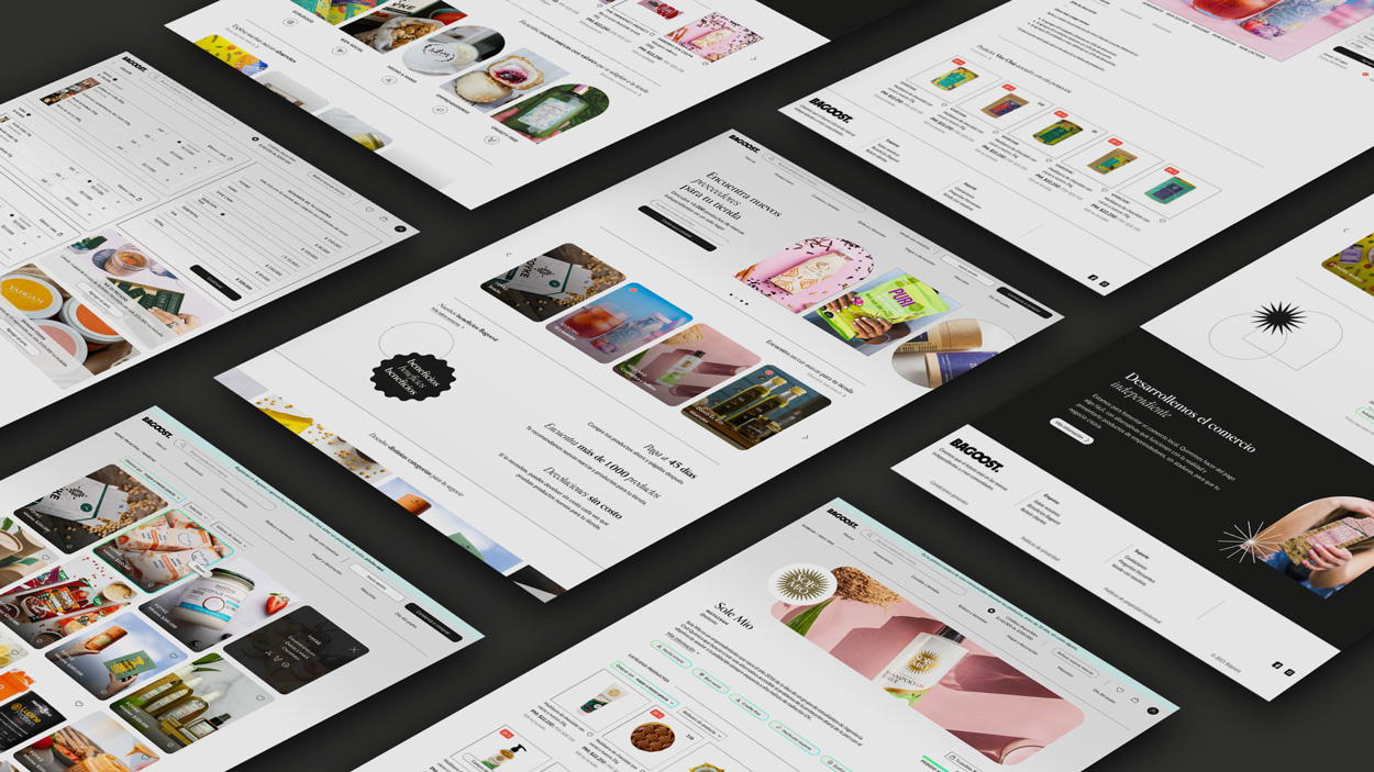
The whole platform: store, brand pages, cart, checkout and a dashboard for brands, designed in Figma as one system.
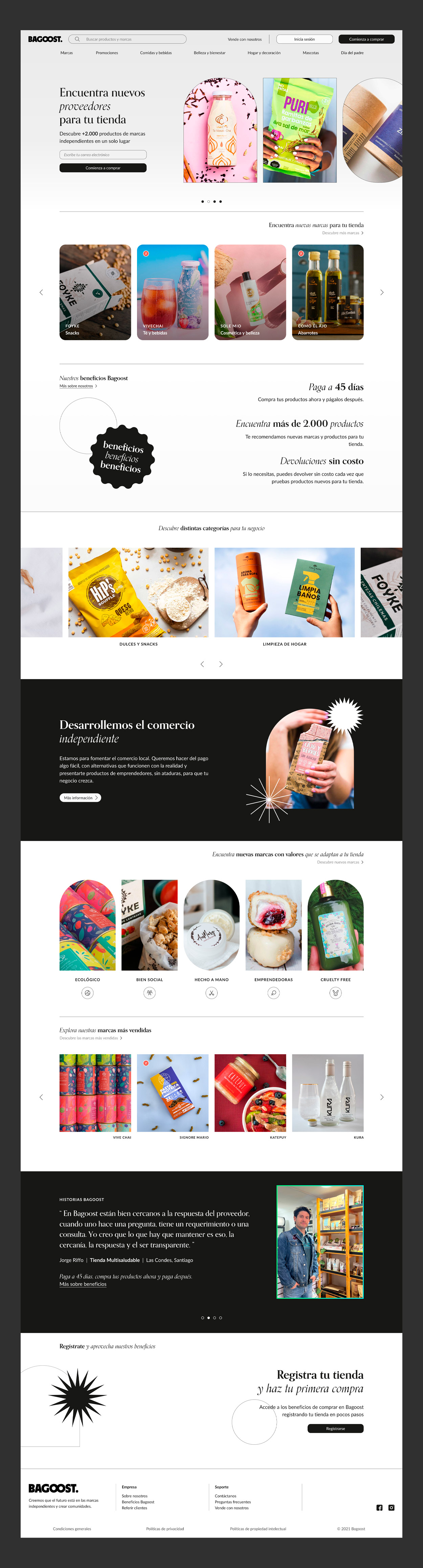
Built for a shop owner who has never heard of us. From the top: what Bagoost is, the three things that matter to a small shop (pay in 45 days, 2,000+ products, free returns), brands to discover by category and by values, and another shop owner's words before asking them to sign up.
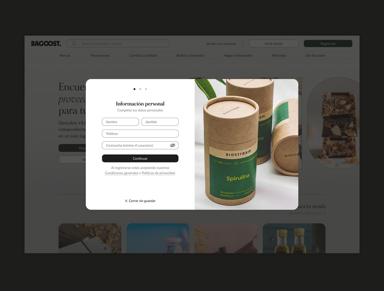
Sign-up in three short steps, over the page instead of away from it, so shops never lose sight of the products. We asked for a phone number so the sales team could call every new shop.
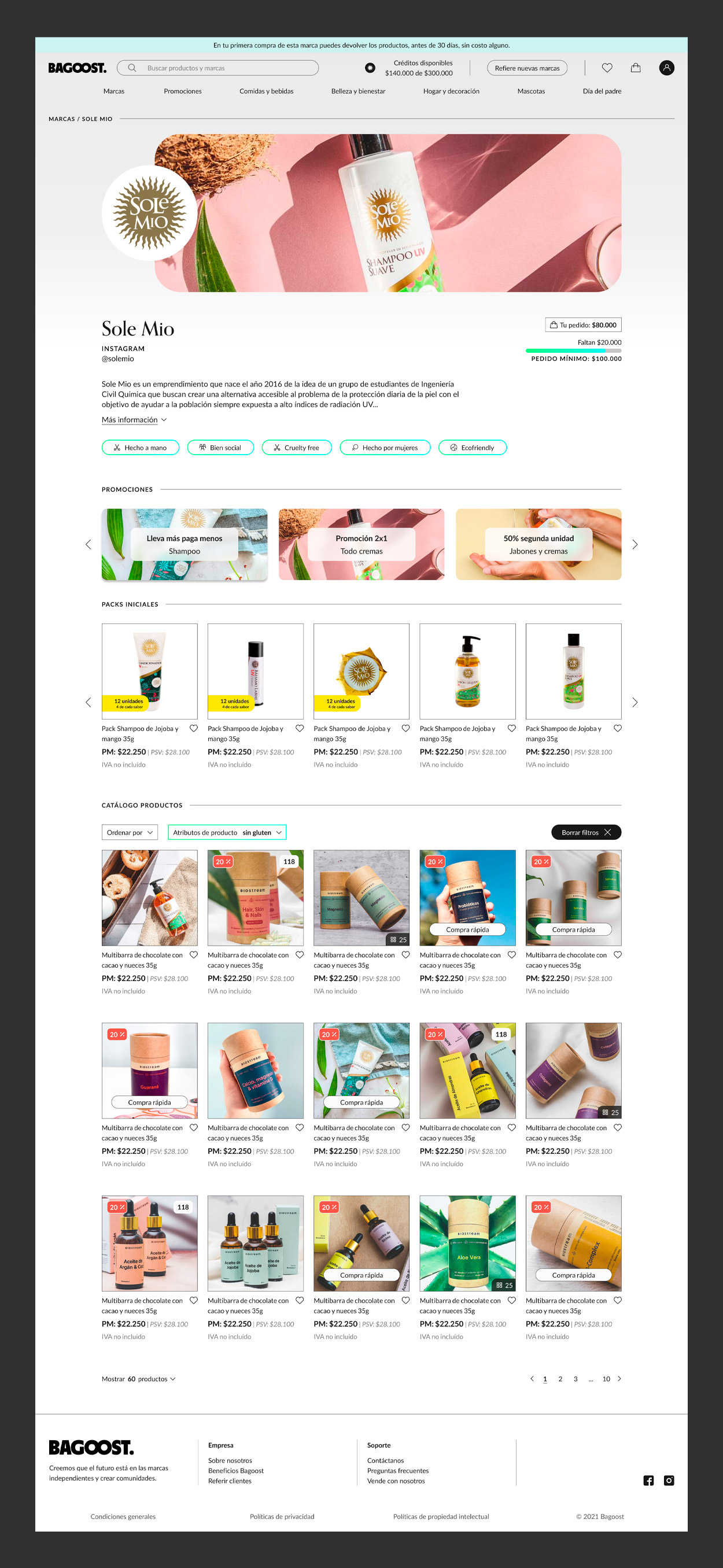
Brands on Bagoost are small, so their story sells as much as their products. Each page opens with who they are and what they stand for, then starter packs to make a first order less risky, then the full catalogue. The minimum order stays visible, with a bar showing how close you are.
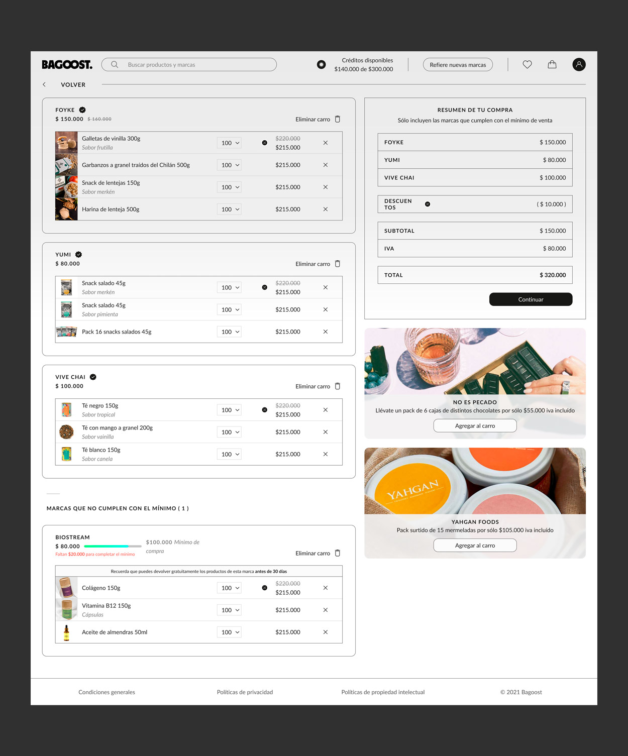
One cart, several brands. Each brand sets its own minimum, so orders are grouped by brand and the ones still short are flagged, with products to reach it, before checkout, not after.
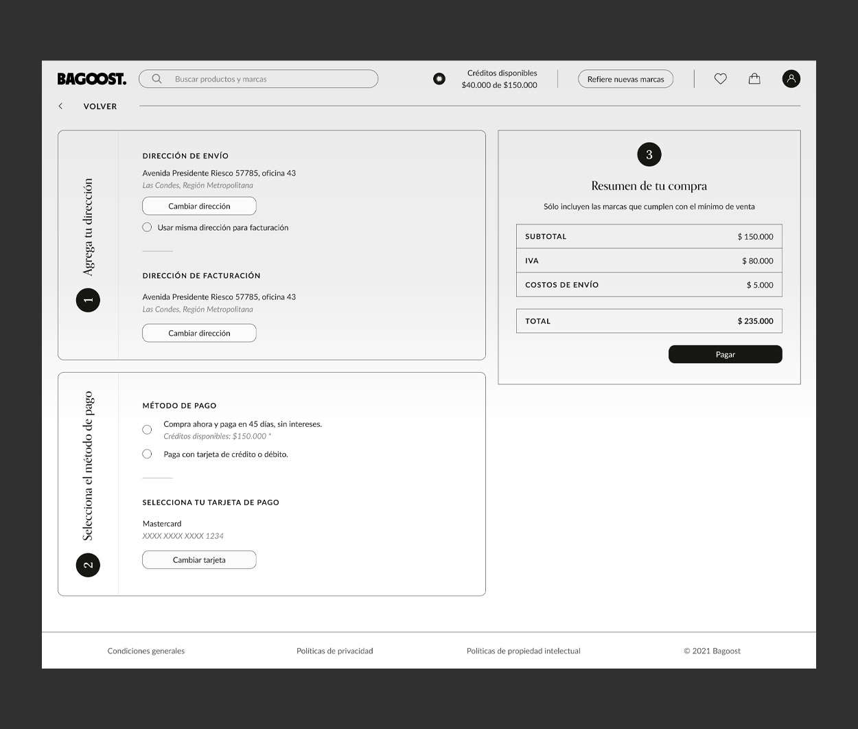
Two steps: address, then payment. Paying in 45 days is the first option, not the fine print.
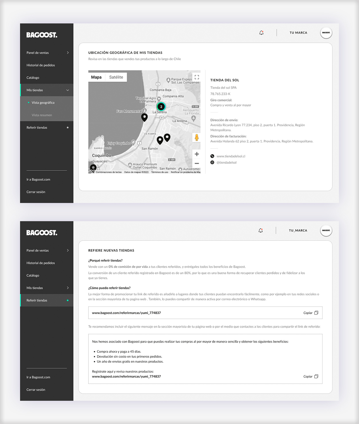
The brand dashboard showed where their products were being sold and gave them a referral link to bring their own shops in. Every brand that joined brought customers with it.
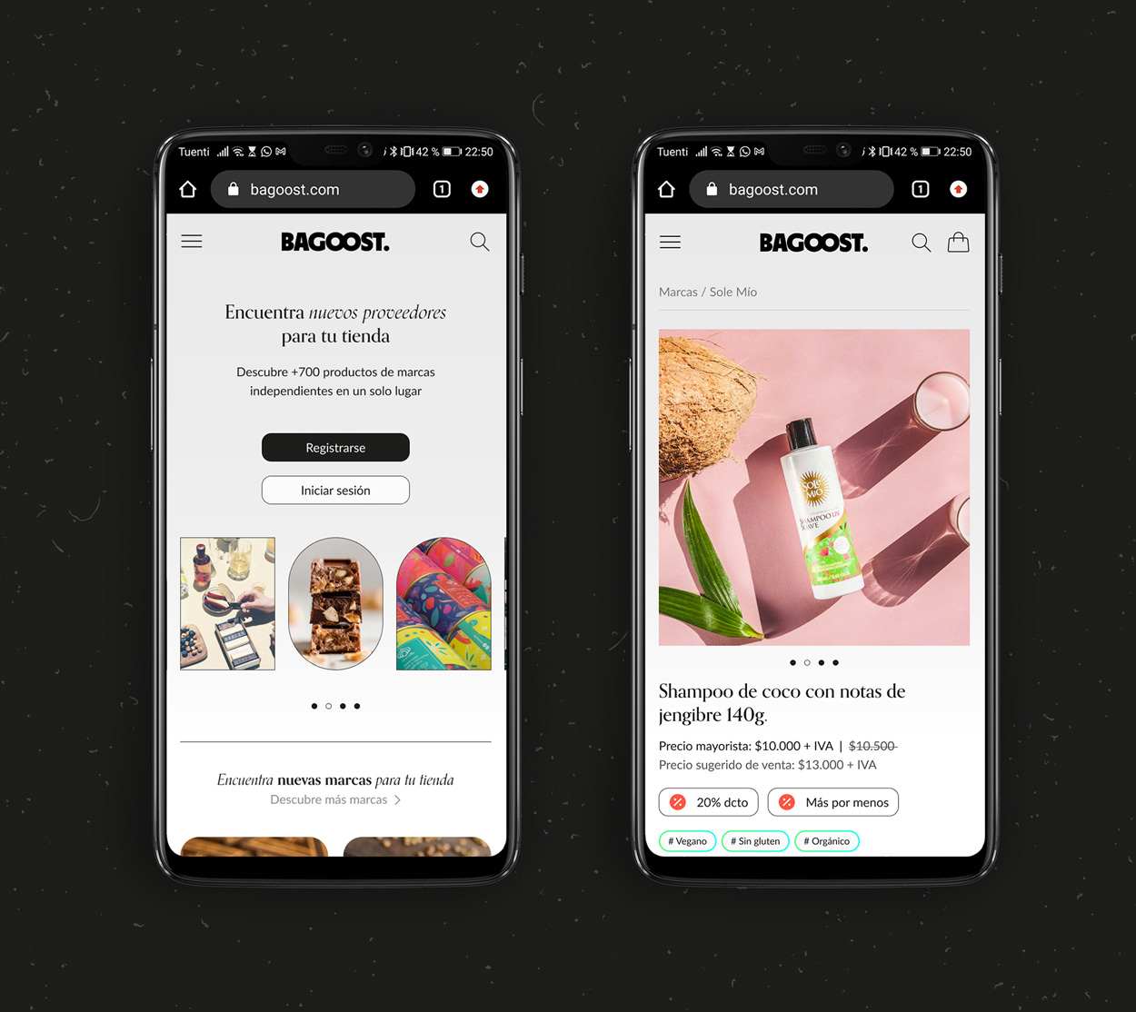
On mobile, every product shows the wholesale price next to the suggested retail price, so shop owners see their margin at a glance.
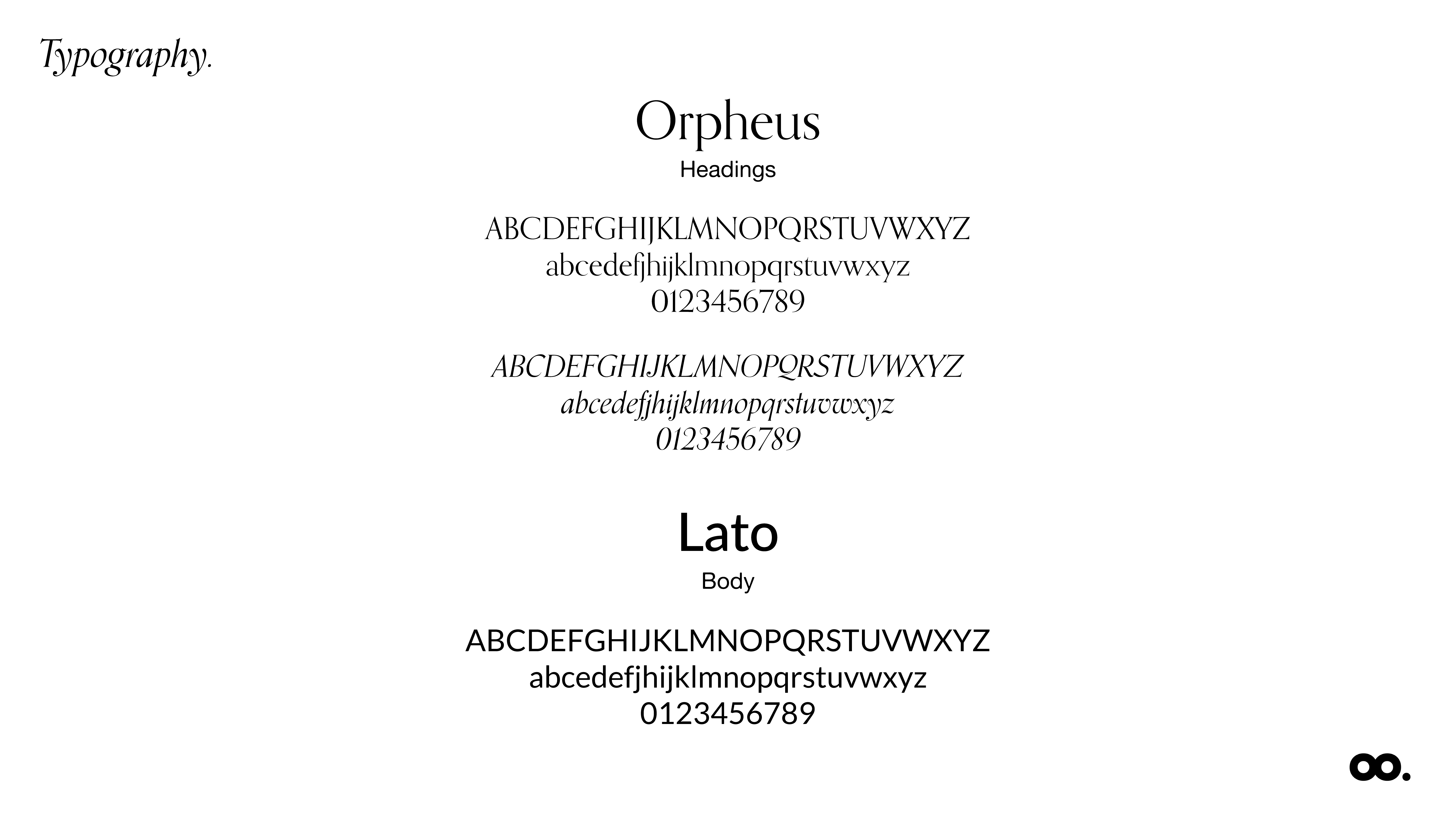
Orpheus for headlines: a serif close to Lora but with more range, to contrast with the body text. Its italic creates focal points within a sentence. Lato for body copy: clean, legible and with enough weights for the whole product.
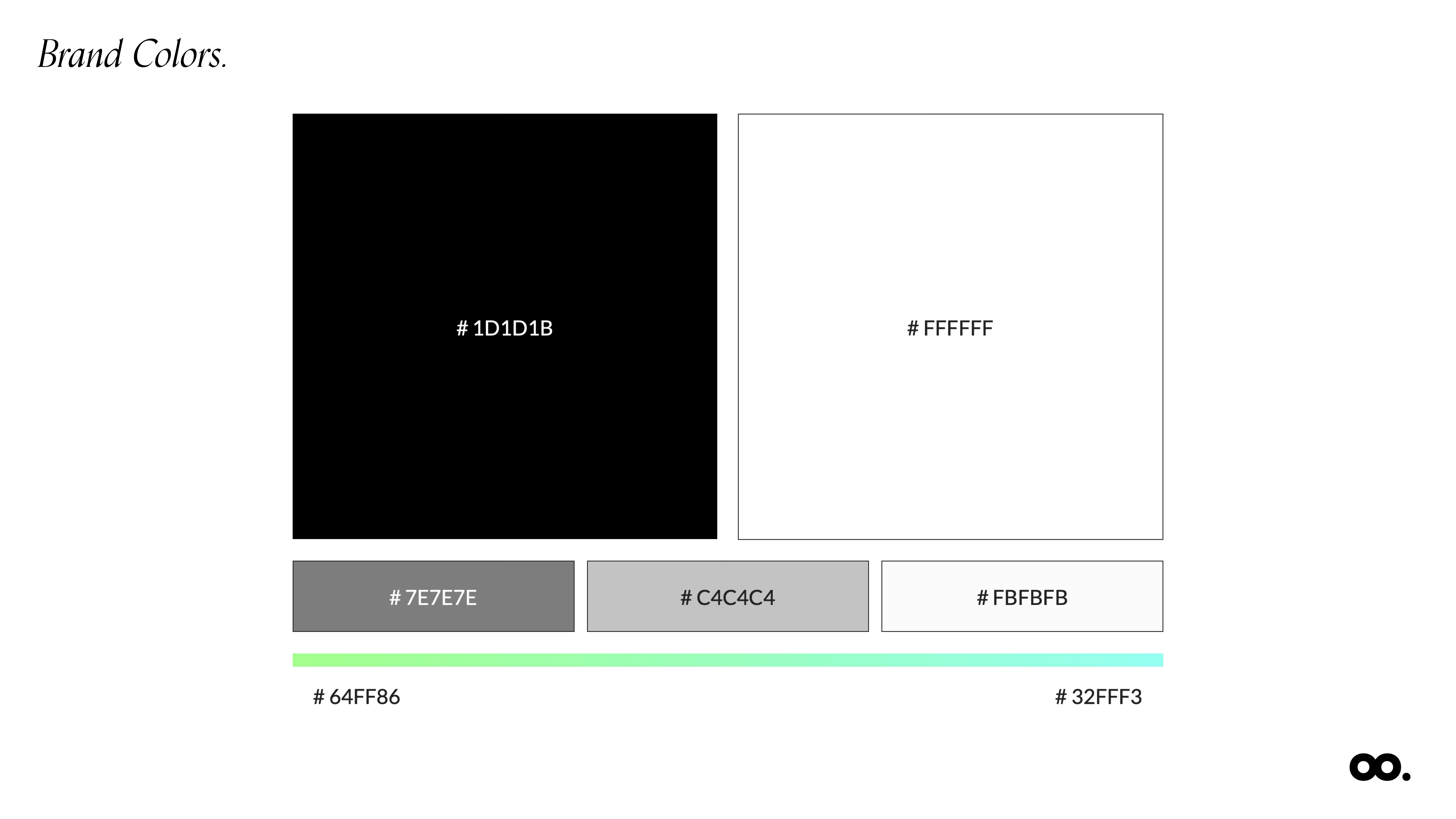
Black and white for the product, so brands' photos carry the colour. A green-to-aqua gradient as the only accent: green for freshness and abundance, aqua for technology and trust.
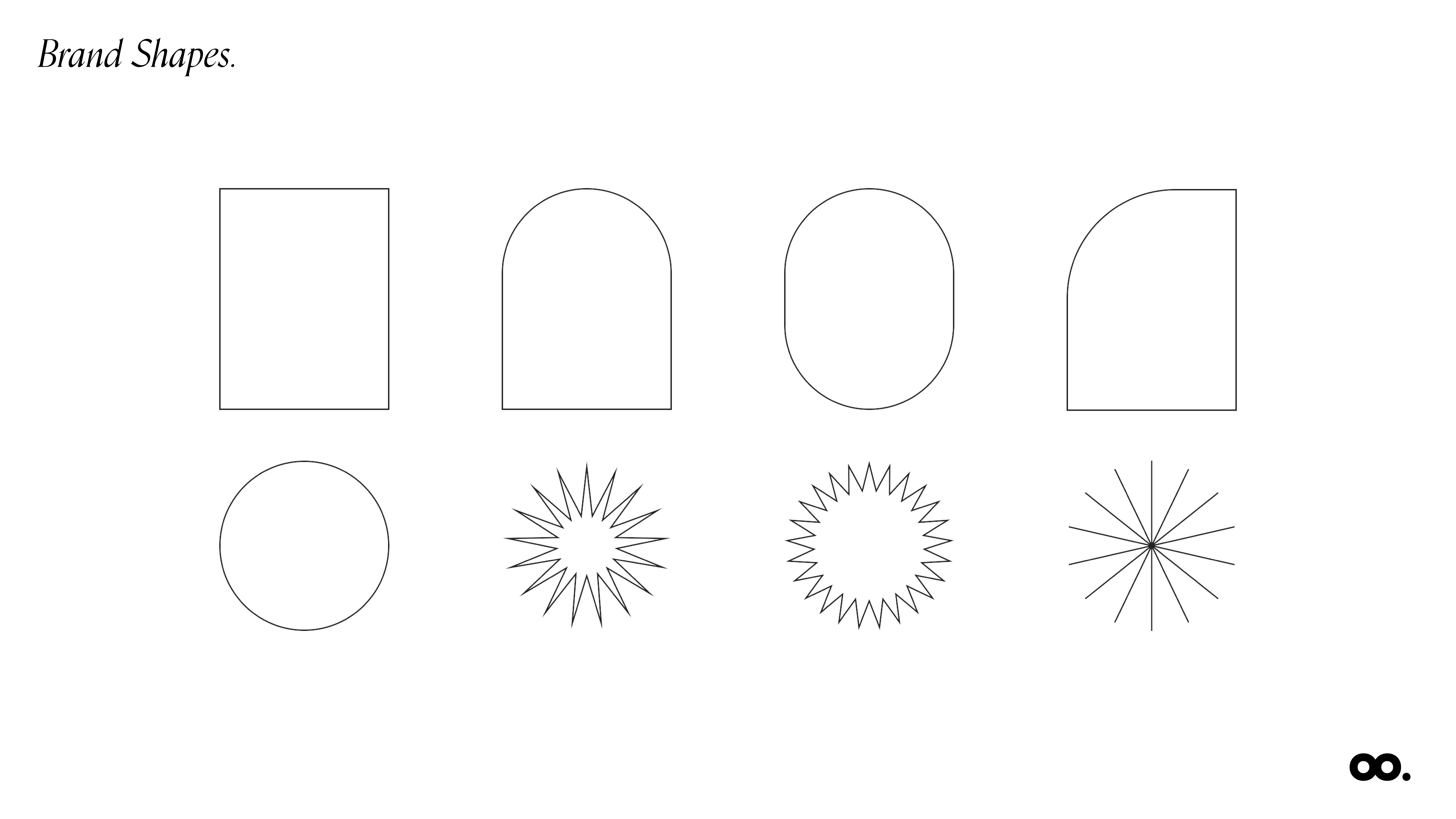
Arches, circles and stars built from simple geometry. They frame photos and fill empty space, pointing the eye to what matters.
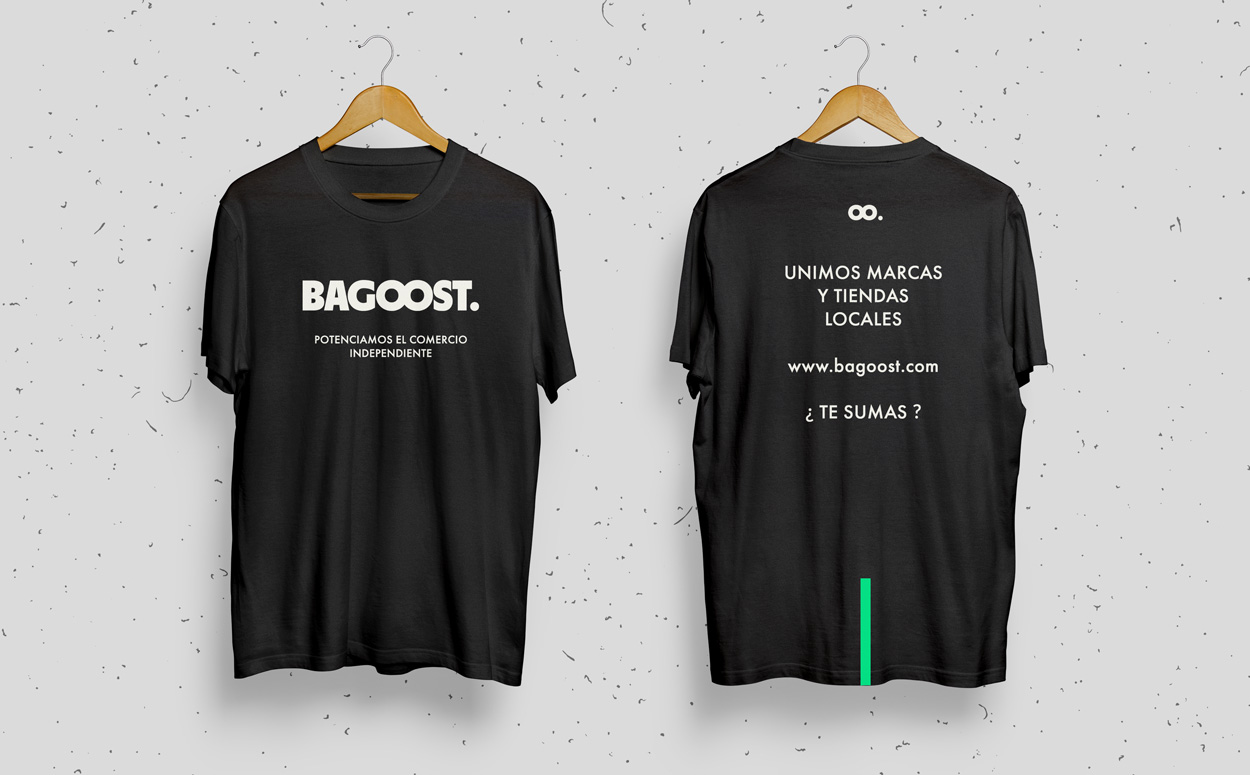
Team shirts. The back did the pitch: "We connect brands and local shops. Want in?"